PILLBOX | 2025 | INFORMATION & HEALTH DESIGN

Designing an app for older adults who struggle to manage their medications

Designing an app for older adults who struggle to manage their medications

Role

Product Designer

Timeline

March -April 2025

Team

Edwin Chu
Shreya Ravi
Yania Zhou

Tools

Figma
Google Suite

OVERVIEW

Pillbox is a mobile app concept developed as part of a school project that combines UX/UI and healthcare-focused design.

Pillbox is a mobile app concept developed as part of a school project that combines UX/UI and healthcare-focused design.

The project brief was to “design an intuitive medication scheduling app for mobile devices that can also be printed out.” The goal of Pillbox was to create a simple and accessible solution that helps users manage their medication schedules while considering the needs of patients, caregivers, and healthcare professionals.

THE PROBLEM

Remembering when to take medications remains a siginificant healthcare challenge in many patients.

Remembering when to take medications remains a siginificant healthcare challenge in many patients.

The World Health Organization (WHO) estimates that “more than half of all medicines are prescribed, dispensed, or sold inappropriately, and that half of all patients fail to take them correctly” (WHO, 2022). This misuse, underuse, or overuse of medication can result in wasted resources and increased health risks.

Research also suggests that mobile applications can support users with long-term medication routines by improving organization, reminders, and time management (Kim et al., 2025). These findings guided the development of Pillbox as an accessible solution to help users better manage their medication schedules.

SOLUTION

Pillbox provides users with customizable daily, weekly, and monthly medication schedules that can be accessed digitally through a smartphone or printed as a physical copy for offline use.

WHY AN APP?

Medication management often involves multiple people, from patients to caregivers and healthcare professionals. Pillbox uses a digital platform to simplify this process by:

  1. Supporting caregivers: Allowing caregivers to help manage a loved one’s medication schedule through shared access.

  2. Simplifying information: Automatically generating organized medication schedules to reduce confusion and improve clarity.

  3. Helping patients stay on track: Providing reminders for medication doses and refills directly through their smartphone.

Medication management often involves multiple people, from patients to caregivers and healthcare professionals. Pillbox uses a digital platform to simplify this process by:

  1. Supporting caregivers: Allowing caregivers to help manage a loved one’s medication schedule through shared access.

  2. Simplifying information: Automatically generating organized medication schedules to reduce confusion and improve clarity.

  3. Helping patients stay on track: Providing reminders for medication doses and refills directly through their smartphone.

Medication management often involves multiple people, from patients to caregivers and healthcare professionals. Pillbox uses a digital platform to simplify this process by:

  1. Supporting caregivers: Allowing caregivers to help manage a loved one’s medication schedule through shared access.

  2. Simplifying information: Automatically generating organized medication schedules to reduce confusion and improve clarity.

  3. Helping patients stay on track: Providing reminders for medication doses and refills directly through their smartphone.

INITIAL RESEARCH

We conducted a literature review to better understand the challenges people face when managing their medications and to identify opportunities for improvement within existing solutions. Our research focused on three key areas:

  1. Medication calendar apps

Exploring existing digital solutions and how they support medication tracking and adherence.

  1. UI between different ages

Understanding accessibility considerations and design principles for users who may experience age-related challenges.

  1. Colour & Iconography

Examining how visual design elements can improve clarity, recognition, and ease of use.

USER GROUP

From our research we found that older adults were the most affected by medication scheduling problems.

Approximately 88 percent of older adults are living with one or more chronic conditions that involves take regular oral medications.

— Wilson et al., 2007

We then developed a persona representing Pillbox's primary target user. This persona captures the key characteristics, goals, needs, and pain points of our intended audience, helping guide our design decisions throughout the project.

COMPETITIVE ANALYSIS PT.1

As part of our research process, we conducted usability testing with participants using a similar medication management app, Max Pill, to identify common pain points and areas for improvement.

Our findings showed that users experienced challenges with:

  1. Participants were unable to preview medication details before adding them to their schedule, creating uncertainty during setup.

  2. Users found that there was no option to specify important details, such as whether medication should be taken with or without food.

  3. Participants found the reminder system confusing, as notifications had to be manually configured instead of being automatically generated.

COMPETITIVE ANALYSIS PT.2

We also analyzed a printed medication schedule provided by Alberta Health Services (AHS) to understand the strengths and limitations of existing non-digital solutions.

Our findings showed that users experienced challenges with:

  1. The table format did not effectively communicate medication frequencies outside of daily routines, such as medications that needed to be taken every two or three days.

  2. The schedule primarily relied on written instructions, providing limited visual cues to help users quickly recognize when and how to take their medications.

  3. The lack of visual hierarchy and reminders made it more difficult for users to quickly understand their medication routines.

USER FLOW

Rather than creating a traditional user flow, we developed a combined user flow and information architecture to map out both the user’s journey and the content within each screen. This helped us define what information users would need at each stage, from adding a medication to managing and tracking it through the app.

The flow also allowed us to visualize the overall experience and ensure that each screen supported the user’s needs throughout their medication routine.

WIREFRAMES

After establishing the user flow, we translated the structure into low-fidelity wireframes. At this stage, we focused on organizing the content, defining the layout, and understanding how users would move through each screen.

We intentionally kept the wireframes free of colour and branding so we could focus on the functionality and overall structure before moving into visual design.

We tested our wireframe on a group of participants and found that there was:

  1. Unclear Iconography & Form Fields: Icons and input fields lacked clarity, making it difficult for participants to understand the purpose of each field and navigate the interface confidently.

  2. Missing Essential Features: Core functions, including Print and Refill Reminders, were not sufficiently visible or discoverable, resulting in low awareness and usability.

  3. Lack of Medication Confirmation in Calendar: Participants expected a clear visual indicator, such as a checkbox, to confirm when a medication had been taken. The absence of this feedback reduced confidence in tracking adherence.

We tested our wireframe on a group of participants and found that there was:

  1. Unclear Iconography & Form Fields: Icons and input fields lacked clarity, making it difficult for participants to understand the purpose of each field and navigate the interface confidently.

  2. Missing Essential Features: Core functions, including Print and Refill Reminders, were not sufficiently visible or discoverable, resulting in low awareness and usability.

  3. Lack of Medication Confirmation in Calendar: Participants expected a clear visual indicator, such as a checkbox, to confirm when a medication had been taken. The absence of this feedback reduced confidence in tracking adherence.

INITIAL PROTOTYPE

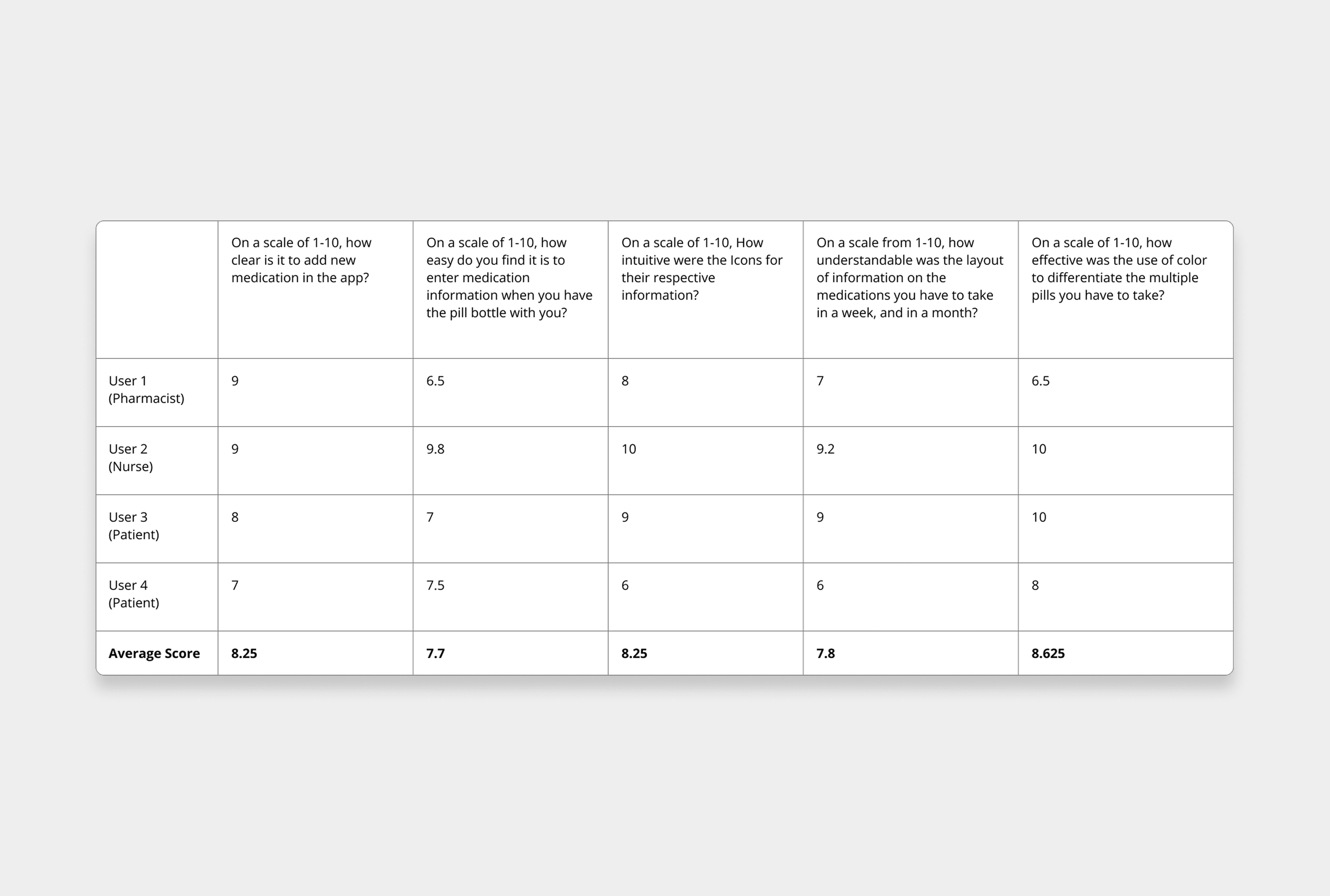
We then put colour and fixed issues from the wireframes and tested the process of adding medications into the app. User testing was conducted with a pharmacist, nurse, and patient to gather feedback from different perspectives.

Key findings included:

  1. Information priority: Users identified that the administration route was more important than the medication brand name, leading us to remove less critical fields.

  2. Terminology changes: We changed “strength” to “dosage” since medications are not always measured in milligrams.

  3. Clearer inputs: Feedback showed that frequency and time selections needed to be simplified, as accuracy is essential for medication scheduling.

We then put colour and fixed issues from the wireframes and tested the process of adding medications into the app. User testing was conducted with a pharmacist, nurse, and patient to gather feedback from different perspectives. Key findings included:

  1. Information priority: Users identified that the administration route was more important than the medication brand name, leading us to remove less critical fields.

  2. Terminology changes - We changed “strength” to “dosage” since medications are not always measured in milligrams.

  3. Clearer inputs - Feedback showed that frequency and time selections needed to be simplified, as accuracy is essential for medication scheduling.

We then put colour and fixed issues from the wireframes and tested the process of adding medications into the app. User testing was conducted with a pharmacist, nurse, and patient to gather feedback from different perspectives.

Key findings included:

  1. Information priority: Users identified that the administration route was more important than the medication brand name, leading us to remove less critical fields.

  2. Terminology changes: We changed “strength” to “dosage” since medications are not always measured in milligrams.

  3. Clearer inputs: Feedback showed that frequency and time selections needed to be simplified, as accuracy is essential for medication scheduling.

FINAL PROTOTYPE

Inside App Screens

Inside App Screens

Notification System

Notification System

Printed Schedule

Printed Schedule

Video Showcase

Video Showcase

CONCLUSION

Designing Pillbox taught me the importance of designing solutions that balance user needs, technical limitations, and project scope. One of the main challenges we faced was working with a limited pool of user testing participants and narrowing the focus of the application while addressing the complexity of medication management.

Through this process, we discovered that Pillbox has the potential to support not only patients, but also caregivers, pharmacists, and healthcare professionals. Future development could include features such as prescription scanning, multi-user accounts, healthcare professional interfaces, and an integrated medication database to improve accessibility and efficiency.

Overall, this project strengthened my understanding of designing within a healthcare context and showed how thoughtful UX/UI design can simplify everyday challenges and create meaningful user experiences.

©EDWINCHUDESIGN2026

©EDWINCHUDESIGN2026

©EDWINCHUDESIGN2026