↑
GP CONNECT | 2026 | UX/UI

Role
Product Designer
Timeline
March - April 2026
Team
Edwin Chu
Shreya Ravi
Anastasia Nikitini
Tayla Hamilton
Tools
Figma
Google Suite
OVERVIEW
The project involved competitive research, user research, and identifying key insights to better understand how people search for a general practitioner. These findings guided the design of an updated experience that addresses user needs in the search and booking process.
THE PROBLEM
Especially in Alberta where the only solution at the moment is Primary Care Alberta which includes basic filter functions, limited information about GPs and unclear call to actions on how to book appointments for users.
5.9 million
people in Canada are still without reliable access to a regular family doctor, nurse practitioner, or primary care team.
5.4 million
Canadians aged 18 and older said that they did not have access to a regular health care provider.
73%
of Canadians between ages 18 to 34 have a regular healthcare provider which is the lowest rate among all age demographics
CURRENT SOLUTION

A basic physician directory which includes:
1. Basic filter functions: The directory provides only basic filtering options, making it difficult for users to narrow down physicians based on the specific preferences and needs that matter to them.
2. Limited information about the GPs: Physician listings provide limited information to help users understand whether a GP is the right fit, requiring users to search elsewhere or contact the clinic for additional details.
3. Unclear call to actions:The directory does not always clearly communicate what users should do next after finding a physician, making the process from finding a GP to contacting or booking with them less intuitive.
RESEARCH GOALS
To understand the challenges users face when searching for a family physician, we began with secondary research to explore the current landscape of primary care access. This was followed by competitor analysis to evaluate existing solutions and semi-structured interviews to gain insight into user behaviours, frustrations, and needs. To guide our research we created 3 research goals.
Goal #1
To understand the current landscape of GP directory websites.
Goal #2
What information patients prioritize when selecting a GP.
Goal #3
How patients book their first appointment with a new GP.
COMPETITIVE ANALYSIS
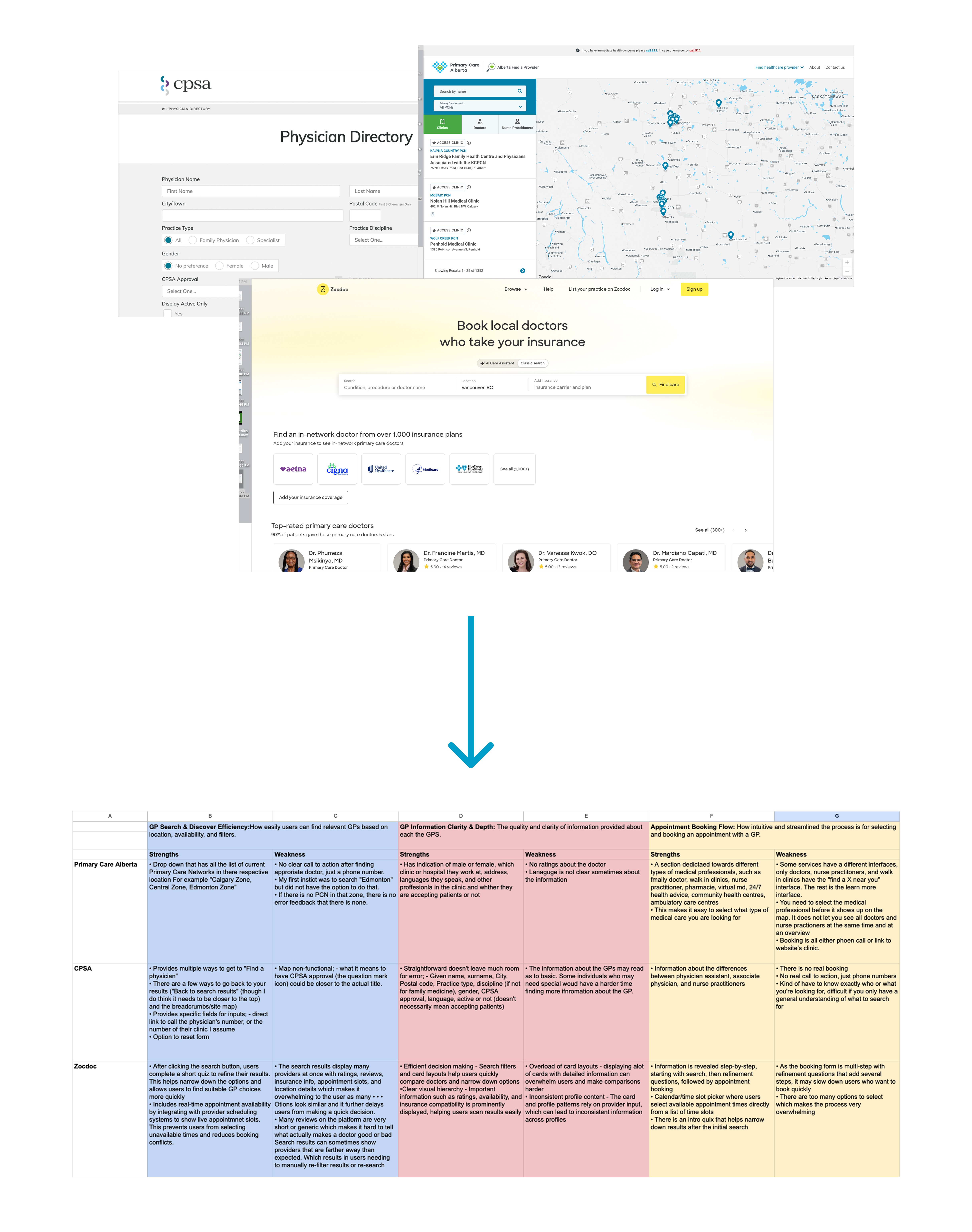
Our analysis revealed to us that current websites have:
Poor Filter usability: Filters were hidden, overwhelming, or lacked clear, intuitive labels, making it difficult for users to refine search results.
Weak call to actions: Competitors prioritized resource links over clear actions like booking or contacting the GP.
Limited Reviews: Reviews were sparse or too brief, making it difficult for users to assess GP quality and patient experiences.
USER INTERVIEWS
Patients have different priorities when choosing a GP, and many reported that existing GP directory websites do not effectively support their needs. To understand these challenges, we conducted semi-structured interviews with with people who were currently looking for a GP or had found one within the past five years. We used Otter.ai to record and transcribe the interviews, then analyzed the transcripts in Taguette by coding and grouping recurring themes to identify patterns across participant responses.

KEY INSIGHTS
From our research, we formulated five key insights that would inform our design. These insights were developed by synthesizing findings from our secondary research, identifying recurring themes in our interviews through thematic tagging and analysis, and conducting a competitive analysis of similar websites and digital experiences. By bringing these sources together, we were able to identify common patterns, user needs, and opportunities that helped shape our design direction.
Users ultimately resort to booking their first appointment through a phone call.
“
I rather call because then you have a person who manages the system, and they can be like, oh yeah, there's actually an open spot.
— Participant B
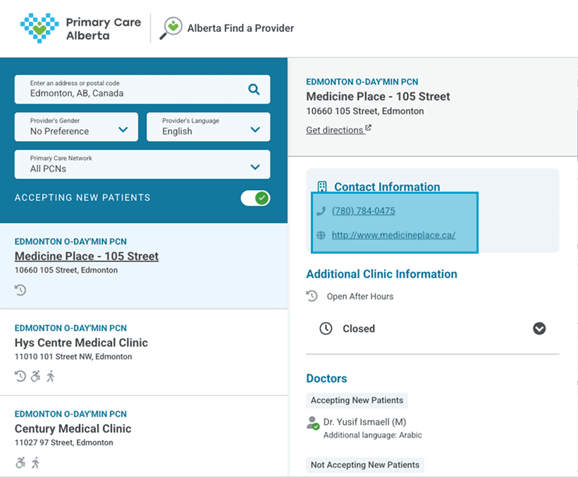
Users are pushed to call because thats the only option. From one of our competitors Primary Care Alberta, the only call to action for booking is a link to the clinic website or a phone number.
Users trust word of mouth when finding a GP.
“
There was some word of mouth, like, somebody said, Oh I went here for this test. And I was like, Okay, I'll go there too yeah.
— Participant A
“
I usually ask friends and family first because then I'll be like, hey, do you know any clinic that has opening for a new patient and that like they're a trustworthy kind of, you know.
— Participant B
Users want a long term relationship with their GPs.
“
While we are still settling in here. I also would like to have a doctor that can work with my family and I for the long-term, not just for emergencies.
— Participant D
Users are not aware that they can access different appointment options with their GPs.
“
The most recent time that i saw my doctor. I just did a call with him rather than actually going there in person.
— Participant F
“
I don't think my mom knows that they can do that, so that was like an after kind of thing that we realized.
— Participant F
When choosing a GP, users ultimately prioritize location and availability above all else.

We used a ranking question during our semi-structured interviews and participants never went below a 7 for proximity, but would have more differing priorities for GP characteristics.
USER GROUP
To narrow down our target user group for the redesign, we identified three primary user groups based on patterns that emerged from our interviews. We considered not only who these users were, but also their priorities and the needs they identified. This helped us understand what each group was looking for, what influenced their decisions, and where their needs overlapped or differed.
Immigrants/Newcomers to Alberta
Priorities: Language, Cultural Sensitivities, Quality of Care, Easy access
Young adults transitioning into adulthood
Priorities: Location, Reviews, Referrals, Hours, Gender, Specialty
Caregivers
Priorities: Accessibility, Language, reviews, specialty,
Quality of Care.
However, our secondary research highlighted young adults as an important user group when considering access to primary care. Canadians aged 18–34 were less likely to have a regular healthcare provider compared to older age groups, suggesting that many young adults face challenges establishing a long-term relationship with a general practitioner.
Although GP Connect is not limited to young adults, this audience helped guide our design decisions because they represent a group that may benefit most from a clearer and more accessible way to find general practitioner.
Immigrants/Newcomers to Alberta
Priorities: Language, Cultural Sensitivities, Quality of Care, Easy access
Young adults transitioning into adulthood
Priorities: Location, Reviews, Referrals, Hours, Gender, Specialty
Caregivers
Priorities: Accessibility, Language, reviews, specialty, Quality of care
THUS,
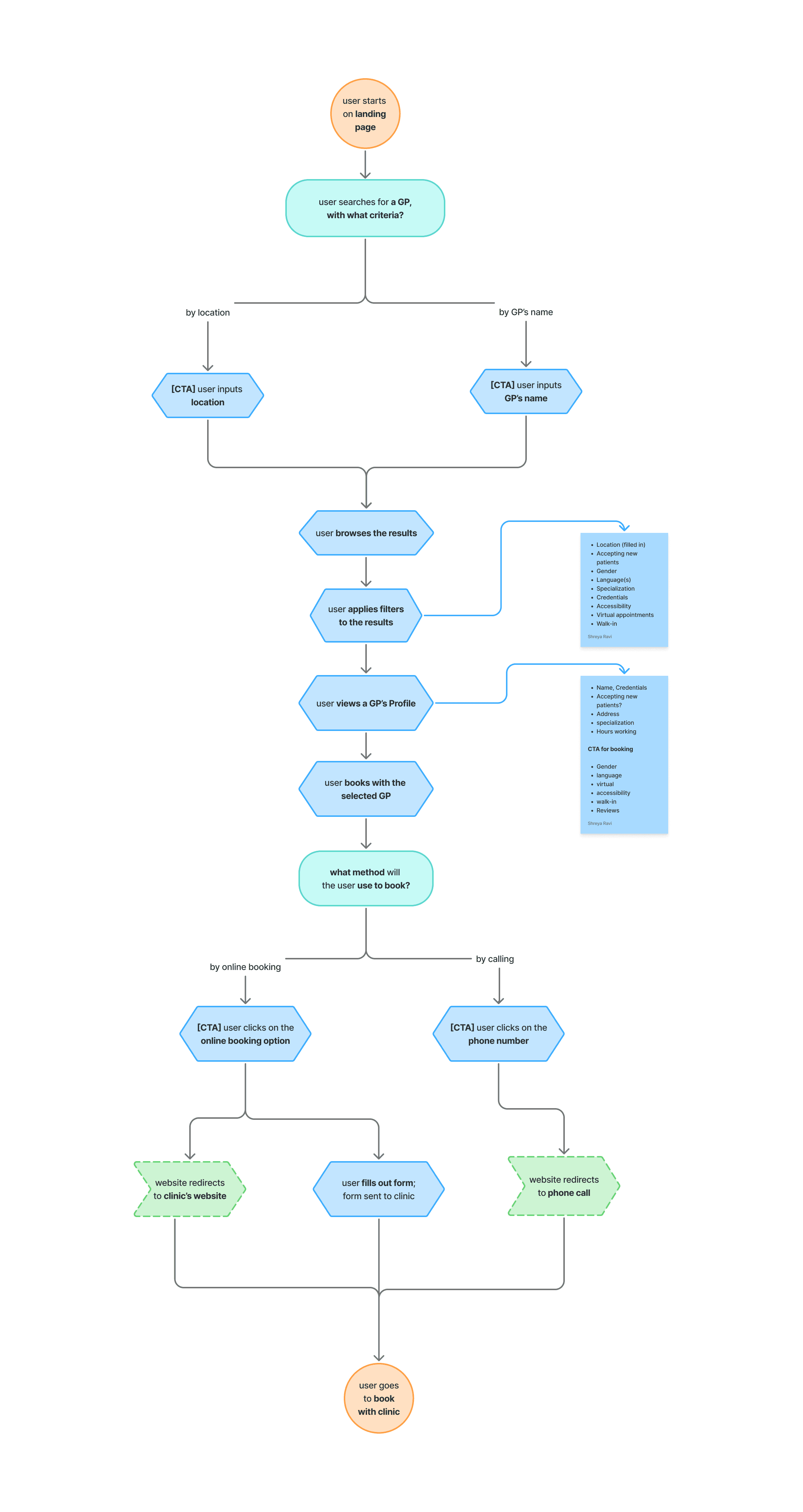
USER FLOW
WIREFRAMES
We then developed wireframes based on our user flow, using the insights from our research to guide decisions around layout, information hierarchy, and overall structure. We iterated on the original site’s layout to determine the most intuitive and effective way to organize information for our target users, prioritizing clarity, ease of navigation, and the needs identified through our research.

KEY DESIGN DECISIONS
Homepage CTA
The redesigned homepage prioritizes users' primary need: finding care by location. Based on user behavior, we removed the unnecessary "search all" option to simplify the experience. Users can still search for a specific doctor when needed, such as through recommendations from friends, family, or other healthcare providers.

GP Information Cards
Compared to the original version, which only displayed the GP's name and location, we added more information to help users make informed decisions. These details were not chosen at random, they reflect the prefernces users ranked as most important during our interviews, making it easier to compare and find the right GP.

GP Details Popout
When a GP is selected, a detailed information panel appears on the left. We prominently highlight the available appointment options based on a key research insight: many patients were unaware of the different ways they could access care. We also introduced two clear primary CTAs—one to call the clinic directly and another to use our booking/contact service, which sends an inquiry email on the user's behalf.

Advanced Filters
The original website displayed too many filters on the main page, making it harder for users to start browsing GPs. We moved advanced filters into a secondary panel to keep the primary experience simple and focused. Inspired by Airbnb, the filter panel updates the number of matching GPs as users refine their search, helping them understand the impact of their selections before applying the filters.

Booking Process
Since clinics use different booking systems, we couldn't design a single appointment booking flow. Instead, we focused on the most universal alternative: an email contact service. For users who prefer not to call, this feature allows them to send a booking inquiry directly to the clinic, making it easier to get their name in the door.

FINAL PROTOTYPE
CONCLUSION
This project taught me the importance of transforming research data into clear insights that can directly inform design decisions. Instead of redesigning a service from the ground up, we focused on identifying existing pain points and creating improvements that addressed real user needs.
I learned that effective UX design is often about refining and enhancing existing experiences through thoughtful decisions backed by research.